top of page
my marking

MY french subject articles marked by Yihu
Yihu : everything is bad the words keep changing colour the design is not good i can barely read the words and don't even mention the grammar since it doesn't even make a sentence. fix them.
make the writing spaced out evenly
marked by ms. Leung
MS. Leung say to make the colour of the background compliment the text colour or just change the text colour and fix the links of the back to menu page
My Biology articles mARked by :Jaeden and Yihu
Jaeden:the words are too small ! Make them larger and easier to read.
Yihu:) Basically your layout is not so ever good theres too much white space and i need better grammar in your sentence's.


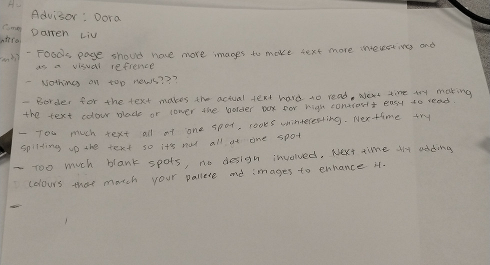
NOTES: for my website
-text too small
-need icon in my articles
-need alignment a specific word fonts in article's
-need to include a summery
- add more examples to my biology
-change the text colour or the background to
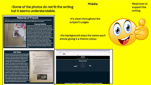
NOTES: #2 FOR ME webstie
-darker colour meybe
-white pace inconsistant
-more consistancy
-to crowded
-some image dont have connection to the writing


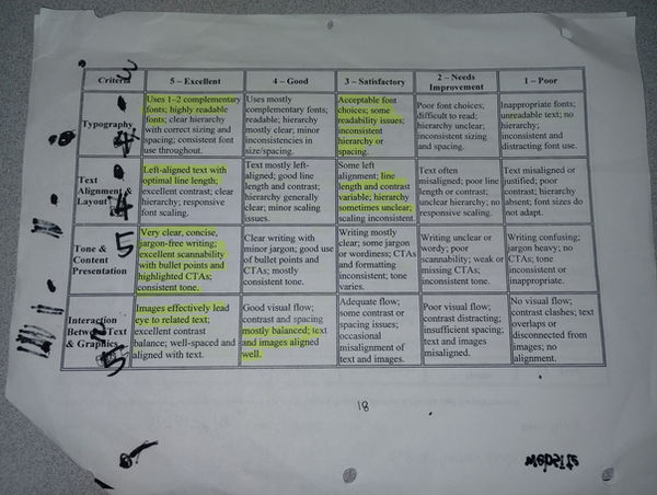
NOTES: #3 for my :( Webstie
bottom of page